39 Steps Coffee
Services | Branding
DLSM Studio (formally DesignLSM) were approached to create a name and brand identity for a new global speciality coffee concept starting its journey in London. The brand needed to appeal to a wide global audience seeking an authentic and honest ‘coffee experience’ in a modern environment.
Inspired by the owner’s obsession for the way coffee is sourced, brewed and served, the name directly references the coffee making process. We discovered that it takes 39 Steps for coffee to go from bean to cup and we shaped the identity around this fact.
Design
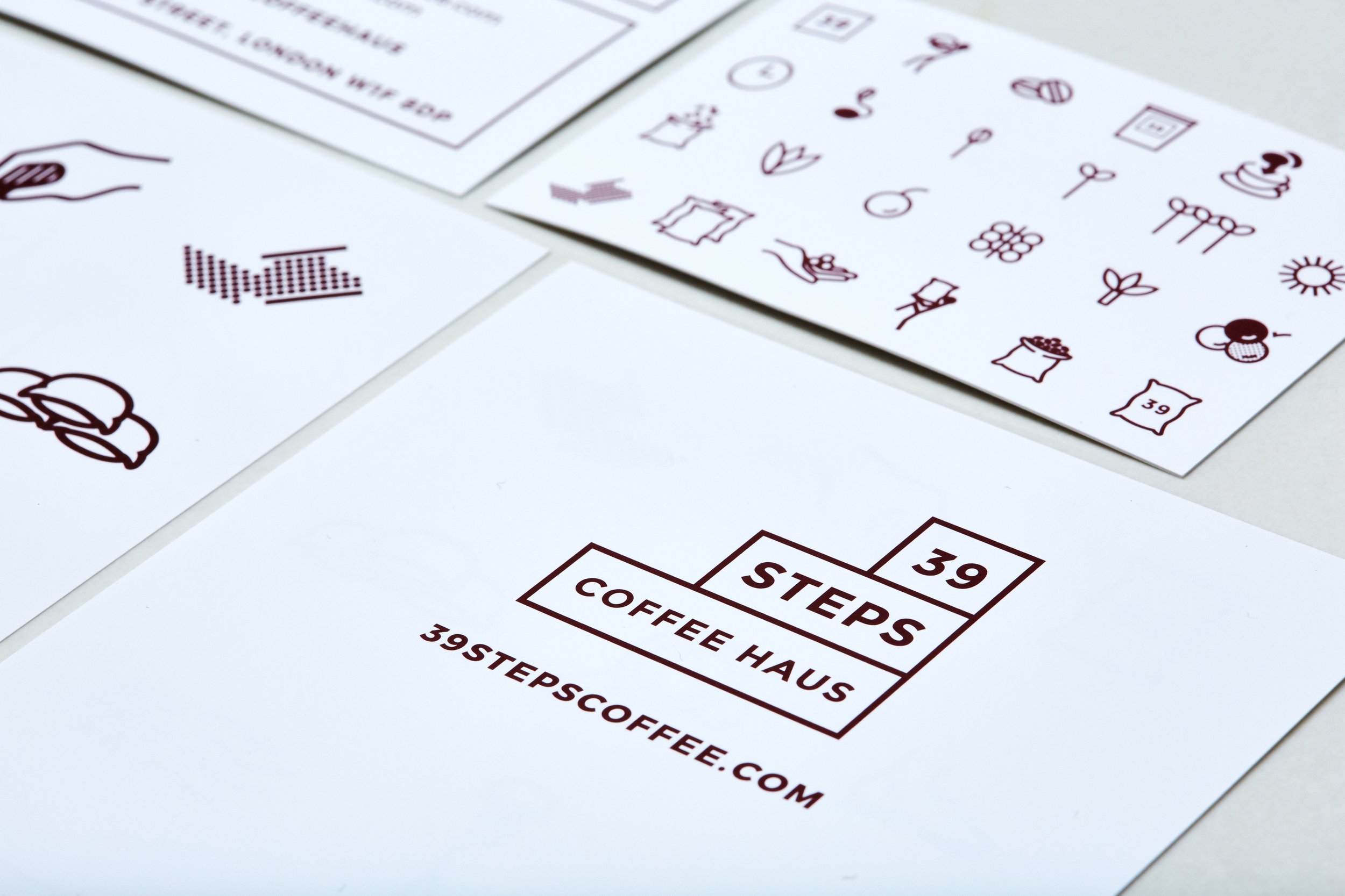
The logo is a graphic representation of the journey and steps, and the colour palette of burgundy and oatmeal reflects the colours in the coffee making process from seed to cherry to bean.
We chose “Montserrat” as the primary and only typeface, which has a modern and bold visual aesthetic.
Detail
We created 39 individual icons to represent each step of the coffee making process. In addition to this, we created an extensive set of icons to illustrate the products and processes in the shop.
We created a pattern out of the icons, which we introduced to all branded merchandise and packaging including coffee bags, take away cups, tote bags, coffee cups, juice bottles and more.


